
Overview
As lead designer on this project, I was responsible for creating all wireframes, UI specs, and pixel-perfect mocks. I worked with the editorial and publishing teams to re-brand an out of date site, rebuild it on a modern platform, and make it more useful for the Simon & Schuster employees it features and more functional to visitors within the industry.
The Problem
When I began working at Simon & Schuster, a Big 5 publishing house, the book business as a whole had started shifting its focus to greater prioritize its digital identity.
As the online community within the industry grew, Simon & Schuster’s flagship imprint faced several problems with their existing B2B website. It had been built in Supadu 1.0, a now-defunct web building tool, which the company no longer subscribed to. The design was also obsolete, many of the important homepage features being visibly broken. Their team page was a long, scrolling list where junior team members were buried, and only very senior team members had their own click-through pages.
Having a reliable, handsomely-designed online presence was important to the imprint as a means to showcase their credibility as a brand. The imprint wanted a modern redesign that looked more aesthetically serious than the old design, but still felt inviting. Junior team members wanted their own pages that could be frequently updated so they could place links in their Twitter and LinkedIn bios. Most importantly, the imprint had just developed a new mission statement and wanted it highly visible.
The Users
The target users of the Simon & Schuster .biz site are publishing industry professionals of all types.
Members of the sales force and competing publishers visit the homepage for quick reminders of what S&S considers its most important books of the season. Agents use the Our Team page as a tool to learn about the editorial team and other staff, to decide which editors might be fit with whom to pitch their authors. S&S staff members themselves use their bios as ways to promote their own interests and backgrounds to attract agents.
Many of these users only peruse this site during the workday at their desktop computers, but it was very important for us to have a mobile presence as well, to accommodate the sales force who travel often and use their phones for business. The old version of this website never had a mobile component, so introducing this was of paramount importance.
Team & Role
I was the sole designer of this product, with occasional support from my art director and project manager. I coordinated and led all facets of design including information architecture, interactions and visuals. My research consisted of short, informal interviews with the staff and learning about their core needs surrounding this product. I also performed a sort of competitive analysis by looking at the .biz sites of Simon & Schuster’s other brands and identifying which features were working best.
Design Process
Once I had complied a list of what my stakeholders needed this website to accomplish, I started sketching rough mocks of the homepage. I knew that several key feature requests needed to be immediately addressed in the sketches, and used those do develop a my idea for an MVP.

UI Design
Based on the feedback I got from the sketches, I decided to begin by designing high fidelity mockups of just the homepage, letting the stakeholder response drive the design of the rest of the site.
The short time invested up front by working through these iterations helped me to easily set the tone and visual style for the site as a whole.
The imprint was delighted to have several very different options to choose from, considering that to them, a primary measure of success for this site would be something that felt fresher and newer than the old one.

The imprint felt a commitment to making sure a variety of team members had a say in the new direction for the site, so the publisher conducted some A/B testing between the different layouts with several departments, especially the marketing department, who would be responsible for most of the content updates once the site went live.
Winning Design
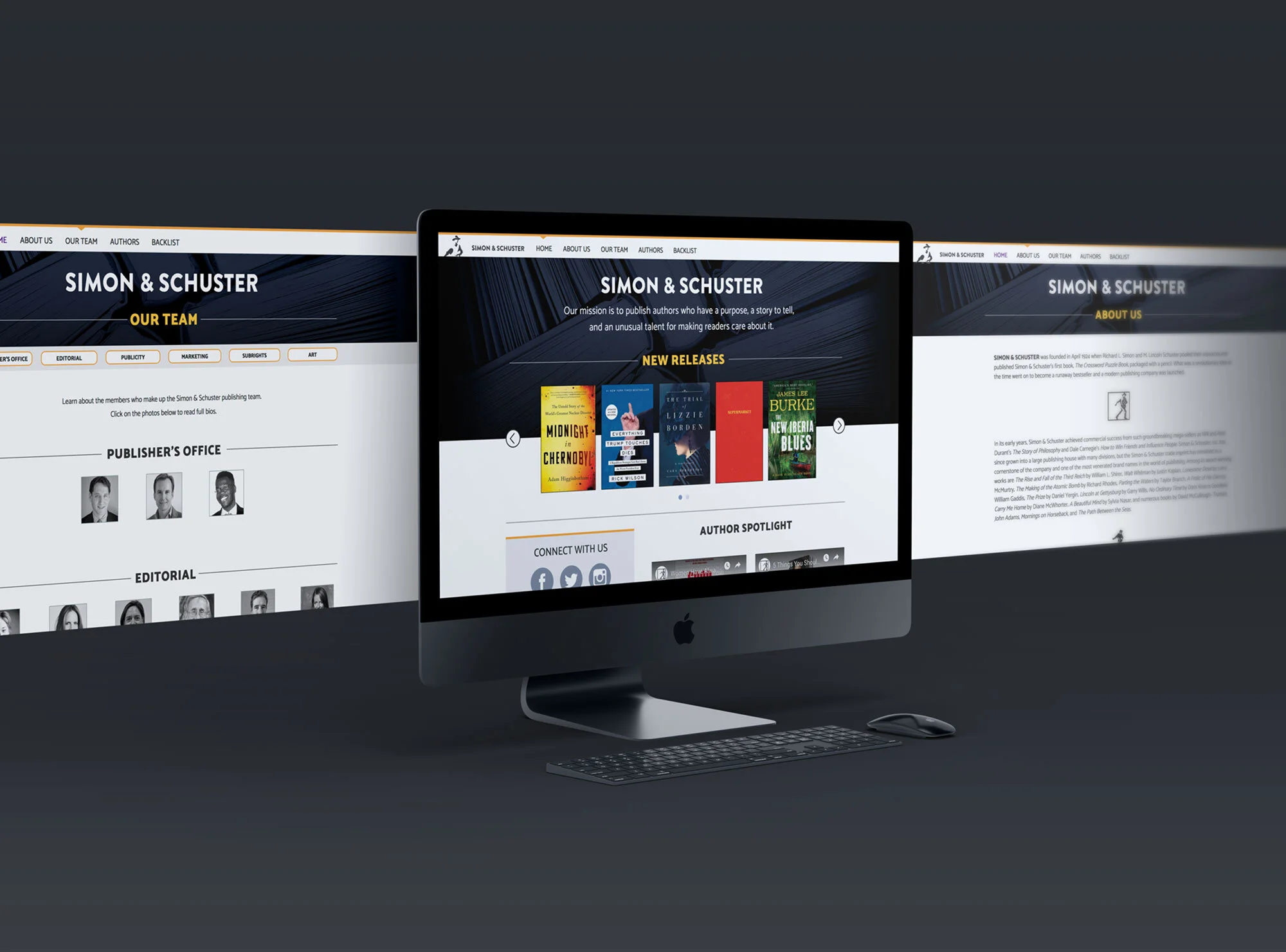
The final design struck a balance between corporate sincerity and welcoming charm.
Much of the color on this site is provided by its ever-changing lineup of books, so I wanted to keep the palette very spare and make sure it wouldn’t compete with the cover designs. A navy blue hero image sets an earnest tone and incorporates a familiar hue used in previous branding, while orange accents add friendly pops of color throughout. I wanted to use a font specifically designed for digital use, so I chose Catamaran, a sans-serif that is polished enough to suit a corporate audience but has enough personality that it feels relaxed and winsome, even set in bold and all caps.
Where the previous site had used Flash Media Player to showcase their videos (a plugin which had stopped working since its initial launch), I partnered with the imprint to start hosting their videos on YouTube which was much easier to integrate. Through this streamlined process I was able to build a spotlight feature on new book specific-videos, and a new message from the publisher, helping to drive home the mission statement they had worked hard to develop. Other new features include a social media side bar and a pop up modal window for the news section.

The design for the Our Team page was a huge departure from the original website. A grid of staff photos arranged by department allows the user to view a much higher volume of faces without scrolling, and a sticky nav bar makes jumping from department to department simple. I decided to use small, black and white images for practical reasons as the staff photos were self-submitted and varied drastically in quality from photo to photo, but the overall look elegantly compliments the navy and orange scheme. Names and titles of each individual are revealed in a sleek rollover, encouraging engagement with the photo grid, but doing so in a quick and scannable way.
Most importantly, each photo is clickable, which created an opportunity for each team member to have their own bio page. These bio pages are simple, and thus, easy to update frequently, and allow each team member something clean and direct to link to via social media.

Outcome
The imprint was very happy with the final site, and they continually give me new content to add each month.Even though the site launched a couple years ago, I continued to improve upon and update this project. Initially built in Adobe Muse with desktop and mobile versions, I recently rebuilt the entire site in Webflow, where it is now fully responsive. I updated every non-photographic image to SVG format, and added new and exciting interactions as my expertise has grown since the initial launch. The imprint was pleased with these updates as this site continues to be a successful online home for the Simon & Schuster imprint.