

Overview
Breakation is a mobile recommendation engine that helps users plan travel itineraries with rest and relaxation in mind. Synced devices and user input help the app understand its user to make personalized travel suggestions and give feedback. This app was my capstone project as a student in the Pratt Institute Mobile UX/UI Certificate Program.
Users
I began with the goal of building a digital product that would solve a pain point pertaining to how millennial travelers plan and document their trip itineraries.
My research consisted of in-depth interviews with subjects between 27 and 33 years old, unmarried with no children, and travel about 2-3 times per year for leisure. They all live in the Greater New York City area.
Mind Map
A mind-mapping exercise helped me extract and organize important characteristics from each of my interview subjects. A trend I picked up on early was a penchant for sedentary hobbies and the habit of filling vacations with lots of touristy activities.

I put together an affinity map to further identify patterns in my interviews.

One trend I noticed was my subjects’ interests in free time and feeling cozy, which seemed to correspond well with their interests in sedentary hobbies like knitting and watching movies. Something else I noticed was the overall desire to use vacation time for rest and recuperation from everyday life, and favorite travel experiences consisting of relaxing activities. They also consistently claimed to favor authentic, local experiences in their travel. This seemed to strike a contrast with my subjects attesting that they enjoy packing their travel itineraries with tourist activities. And I noticed friction between these two tendencies, hearing from many subjects that they arrived home from vacations feeling more exhausted than they were before. This left me with a problem to solve.

Insight
Millennial travelers have busy lives and limited paid time off. They want to relax on their vacation days. However, they also want to make the most out of their trips, and end up planning so much activity into their vacation itineraries that they come home feeling more exhausted than they were before they left. They need a vacation from their vacation.
How might we help millennial travelers prioritize rest and relaxation in their trip itineraries?
Ideating
Along with my why, I devised a WHAT and a HOW.

I would build a mobile tool to enforce relaxation, meditation and mindfulness in a travel itinerary. Features would include a survey to extract a user’s relaxation goals and interests, easily-searchable relaxing activities with mapsshowing tourist destinations nearby, a travel journal to promote mindfulness, a section with audio meditations for easy listening, and a soothing, uncluttered itinerary for simple planning.
Creating a persona helped me distill and understand the characteristics and habits of my target user under one umbrella.

And my customer journey helped me map pain points in my persona’s usual process of planning trip itineraries, and allowed me to identify opportunities within the process along the way.

Sketching
I began sketching ideas of how to suit my potential users’ relaxation needs.
I wanted the app to be soothing and delightful, so a main goal was to make the process of inputting information into the app fun. For example, I theorized that using big, colorful sliders and illustrations for setting preferences and syncing devices would make the arduous task of data entry more engaging.


Testing

Paper prototyping helped me validate which of my sketches were working and which needed more clarity and further iteration.
My test users liked the itinerary planning steps being broken down into a flow of simple screens with limited, graphic information, but they felt there were just a couple too many steps. My mission then was to condense the flow.
Though my initial paper prototyping went well, as I began wireframing I began receiving feedback that my idea was becoming too generic. At this point I revisit my initial concepts and make sure each piece of the design was contributing to the goal of promoting relaxation in a measurable way. It was in this phase that I started to think of my product as a recommendation engine.


As a result of this pivot, I decided to reduce my emphasis on mindfulness and completely scrap the meditations audio feature, concluding with a minimum viable product most focused on learning its user and enforcing relaxation based upon the user’s preferences and behaviors.
User Flow

UI Design
Moving onto my design, I wanted my product to have a calm, soothing and minimalist aesthetic, an ease of use, and charming illustrations and animations.
A gradient inspired by Caribbean water frames an otherwise sparse and clean interface, highlighted with one contrast color and beautiful scenic photography.


Subtly animated flowing water on the home screen sets an instantly relaxing tone for the product, framing easy access to the user’s most current active itinerary.

Graphic sliders make entering data like sleep preferences and relaxation goals more fun and engaging within the itinerary planning process.
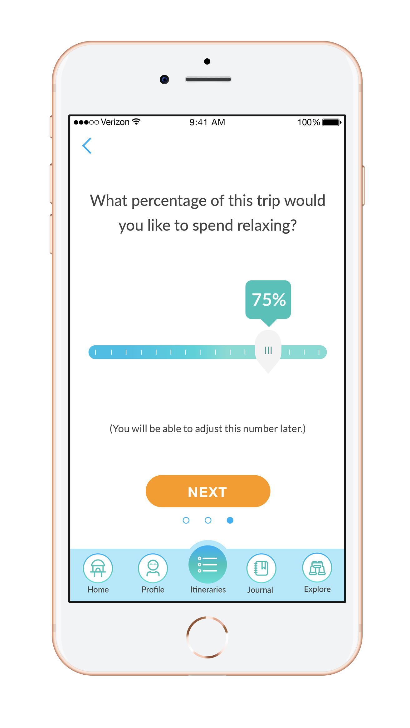
Entering preferences a series of short screens makes tedious data entry more digestible.

Custom illustrations make onboarding and in-app notifications an amusing experience.

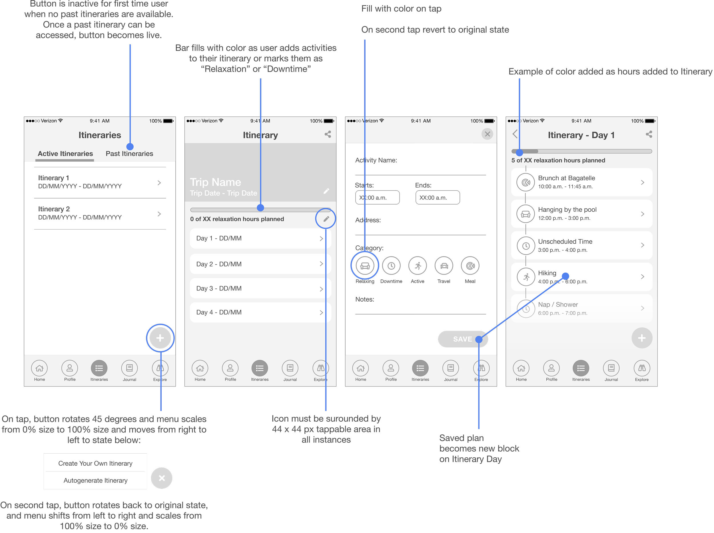
A page of relaxing activity suggestions can be accessed within the itinerary planner

Users can categorize their itinerary plans as Relaxation, Downtime, Active, Travel, or Meal, helping the app calculate their total relaxation hours. The limited category selection does not overwhelm the user with choices.

Each itinerary item can be expanded to more detailed view with a map, and can be easily edited.

Users can practice mindfulness and self reflection while giving the app trip information in their travel journals. The app takes each journal entry and converts it to data which informs its activity suggestions and trip reports.

A daily trip report informs the user of their daily activity and rest statistics, and suggests changes for future itineraries based on those results.
Outcome
By the end of the project I had a prototype that I was happy with and an experience from which I learned a lot. While I really enjoyed the research and data collection, I have more of a visual arts background so as I neared the high fidelity design stage, I turned my attention mostly toward that. In hindsight, this product could have done with more iteration and user testing, and because of that I would say that my design experience actually acted as a roadblock.
Going forward, I will continue to test this product and iterate on its features. I want to think of ways I can make the recommendations in the app more prevalent and powerful, and flesh out the trip reports, which I think could be more visible, but I ran out to time to work with this feature to its full potential,
I have gotten feedback from test users telling me that the concept of a real Breakation would be useful in their lives, which feels like a step toward success.